value |
```python
dict | None
```
|
None |
A dict or None. The dictionary must contain a key 'image' with either an URL to an image, a numpy image or a PIL image. Optionally it may contain a key 'boxes' with a list of boxes. Each box must be a dict wit the keys: 'xmin', 'ymin', 'xmax' and 'ymax' with the absolute image coordinates of the box. Optionally can also include the keys 'label' and 'color' describing the label and color of the box. Color must be a tuple of RGB values (e.g. `(255,255,255)`). Optionally can also include the keys 'orientation' with a integer between 0 and 3, describing the number of times the image is rotated by 90 degrees in frontend, the rotation is clockwise. |
boxes_alpha |
```python
float | None
```
|
None |
Opacity of the bounding boxes 0 and 1. |
label_list |
```python
list[str] | None
```
|
None |
List of valid labels. |
label_colors |
```python
list[str] | None
```
|
None |
Optional list of colors for each label when `label_list` is used. Colors must be a tuple of RGB values (e.g. `(255,255,255)`). |
box_min_size |
```python
int | None
```
|
None |
Minimum valid bounding box size. |
handle_size |
```python
int | None
```
|
None |
Size of the bounding box resize handles. |
box_thickness |
```python
int | None
```
|
None |
Thickness of the bounding box outline. |
box_selected_thickness |
```python
int | None
```
|
None |
Thickness of the bounding box outline when it is selected. |
disable_edit_boxes |
```python
bool | None
```
|
None |
Disables the ability to set and edit the label and color of the boxes. |
single_box |
```python
bool
```
|
False |
If True, at most one box can be drawn. |
height |
```python
int | str | None
```
|
None |
The height of the displayed image, specified in pixels if a number is passed, or in CSS units if a string is passed. |
width |
```python
int | str | None
```
|
None |
The width of the displayed image, specified in pixels if a number is passed, or in CSS units if a string is passed. |
image_mode |
```python
"1"
| "L"
| "P"
| "RGB"
| "RGBA"
| "CMYK"
| "YCbCr"
| "LAB"
| "HSV"
| "I"
| "F"
```
|
"RGB" |
"RGB" if color, or "L" if black and white. See https://pillow.readthedocs.io/en/stable/handbook/concepts.html for other supported image modes and their meaning. |
sources |
```python
list["upload" | "webcam" | "clipboard"] | None
```
|
["upload", "webcam", "clipboard"] |
List of sources for the image. "upload" creates a box where user can drop an image file, "webcam" allows user to take snapshot from their webcam, "clipboard" allows users to paste an image from the clipboard. If None, defaults to ["upload", "webcam", "clipboard"]. |
image_type |
```python
"numpy" | "pil" | "filepath"
```
|
"numpy" |
The format the image is converted before being passed into the prediction function. "numpy" converts the image to a numpy array with shape (height, width, 3) and values from 0 to 255, "pil" converts the image to a PIL image object, "filepath" passes a str path to a temporary file containing the image. If the image is SVG, the `type` is ignored and the filepath of the SVG is returned. |
label |
```python
str | None
```
|
None |
The label for this component. Appears above the component and is also used as the header if there are a table of examples for this component. If None and used in a `gr.Interface`, the label will be the name of the parameter this component is assigned to. |
container |
```python
bool
```
|
True |
If True, will place the component in a container - providing some extra padding around the border. |
scale |
```python
int | None
```
|
None |
relative size compared to adjacent Components. For example if Components A and B are in a Row, and A has scale=2, and B has scale=1, A will be twice as wide as B. Should be an integer. scale applies in Rows, and to top-level Components in Blocks where fill_height=True. |
min_width |
```python
int
```
|
160 |
minimum pixel width, will wrap if not sufficient screen space to satisfy this value. If a certain scale value results in this Component being narrower than min_width, the min_width parameter will be respected first. |
interactive |
```python
bool | None
```
|
True |
if True, will allow users to upload and annotate an image; if False, can only be used to display annotated images. |
visible |
```python
bool
```
|
True |
If False, component will be hidden. |
elem_id |
```python
str | None
```
|
None |
An optional string that is assigned as the id of this component in the HTML DOM. Can be used for targeting CSS styles. |
elem_classes |
```python
list[str] | str | None
```
|
None |
An optional list of strings that are assigned as the classes of this component in the HTML DOM. Can be used for targeting CSS styles. |
render |
```python
bool
```
|
True |
If False, component will not render be rendered in the Blocks context. Should be used if the intention is to assign event listeners now but render the component later. |
show_label |
```python
bool | None
```
|
None |
if True, will display label. |
show_download_button |
```python
bool
```
|
True |
If True, will show a button to download the image. |
show_share_button |
```python
bool | None
```
|
None |
If True, will show a share icon in the corner of the component that allows user to share outputs to Hugging Face Spaces Discussions. If False, icon does not appear. If set to None (default behavior), then the icon appears if this Gradio app is launched on Spaces, but not otherwise. |
show_clear_button |
```python
bool | None
```
|
True |
If True, will show a button to clear the current image. |
show_remove_button |
```python
bool | None
```
|
None |
If True, will show a button to remove the selected bounding box. |
handles_cursor |
```python
bool | None
```
|
True |
If True, the cursor will change when hovering over box handles in drag mode. Can be CPU-intensive. |
use_default_label |
```python
bool | None
```
|
False |
If True, the first item in label_list will be used as the default label when creating boxes. |
enable_keyboard_shortcuts |
```python
bool
```
|
True |
If True, the component will respond to keyboard events. |
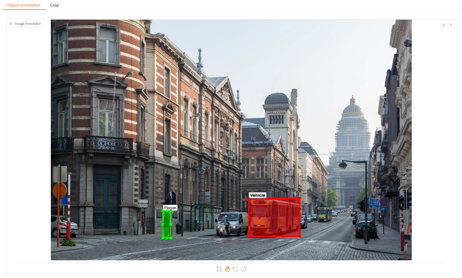
 A Gradio component that can be used to annotate images with bounding boxes.

## Keyboard Shortcuts:
- `C`: Create mode
- `D`: Drag mode
- `E`: Edit selected box (same as double-click a box)
- `Delete`: Remove selected box
- `Space`: Reset view (zoom/pan)
- `Enter`: Confirm modal dialog
- `Escape`: Cancel/close modal dialog
## Installation
```bash
pip install gradio_image_annotation
```
## Usage
```python
import gradio as gr
from gradio_image_annotation import image_annotator
import numpy as np
example_annotation = {
"image": "https://gradio-builds.s3.amazonaws.com/demo-files/base.png",
"boxes": [
{
"xmin": 636,
"ymin": 575,
"xmax": 801,
"ymax": 697,
"label": "Vehicle",
"color": (255, 0, 0)
},
{
"xmin": 360,
"ymin": 615,
"xmax": 386,
"ymax": 702,
"label": "Person",
"color": (0, 255, 0)
}
]
}
examples_crop = [
{
"image": "https://raw.githubusercontent.com/gradio-app/gradio/main/guides/assets/logo.png",
"boxes": [
{
"xmin": 30,
"ymin": 70,
"xmax": 530,
"ymax": 500,
"color": (100, 200, 255),
}
],
},
{
"image": "https://gradio-builds.s3.amazonaws.com/demo-files/base.png",
"boxes": [
{
"xmin": 636,
"ymin": 575,
"xmax": 801,
"ymax": 697,
"color": (255, 0, 0),
},
],
},
]
def crop(annotations):
if angle := annotations.get("orientation", None):
annotations["image"] = np.rot90(annotations["image"], k=-angle)
if annotations["boxes"]:
box = annotations["boxes"][0]
return annotations["image"][
box["ymin"]:box["ymax"],
box["xmin"]:box["xmax"]
]
return None
def get_boxes_json(annotations):
return annotations["boxes"]
with gr.Blocks() as demo:
with gr.Tab("Object annotation", id="tab_object_annotation"):
annotator = image_annotator(
example_annotation,
label_list=["Person", "Vehicle"],
label_colors=[(0, 255, 0), (255, 0, 0)],
)
button_get = gr.Button("Get bounding boxes")
json_boxes = gr.JSON()
button_get.click(get_boxes_json, annotator, json_boxes)
with gr.Tab("Crop", id="tab_crop"):
with gr.Row():
annotator_crop = image_annotator(
examples_crop[0],
image_type="numpy",
disable_edit_boxes=True,
single_box=True,
)
image_crop = gr.Image()
button_crop = gr.Button("Crop")
button_crop.click(crop, annotator_crop, image_crop)
gr.Examples(examples_crop, annotator_crop)
with gr.Accordion("Keyboard Shortcuts"):
gr.Markdown("""
- ``C``: Create mode
- ``D``: Drag mode
- ``E``: Edit selected box (same as double-click a box)
- ``Delete``: Remove selected box
- ``Space``: Reset view (zoom/pan)
- ``Enter``: Confirm modal dialog
- ``Escape``: Cancel/close modal dialog
""")
if __name__ == "__main__":
demo.launch()
```
## `image_annotator`
### Initialization
A Gradio component that can be used to annotate images with bounding boxes.

## Keyboard Shortcuts:
- `C`: Create mode
- `D`: Drag mode
- `E`: Edit selected box (same as double-click a box)
- `Delete`: Remove selected box
- `Space`: Reset view (zoom/pan)
- `Enter`: Confirm modal dialog
- `Escape`: Cancel/close modal dialog
## Installation
```bash
pip install gradio_image_annotation
```
## Usage
```python
import gradio as gr
from gradio_image_annotation import image_annotator
import numpy as np
example_annotation = {
"image": "https://gradio-builds.s3.amazonaws.com/demo-files/base.png",
"boxes": [
{
"xmin": 636,
"ymin": 575,
"xmax": 801,
"ymax": 697,
"label": "Vehicle",
"color": (255, 0, 0)
},
{
"xmin": 360,
"ymin": 615,
"xmax": 386,
"ymax": 702,
"label": "Person",
"color": (0, 255, 0)
}
]
}
examples_crop = [
{
"image": "https://raw.githubusercontent.com/gradio-app/gradio/main/guides/assets/logo.png",
"boxes": [
{
"xmin": 30,
"ymin": 70,
"xmax": 530,
"ymax": 500,
"color": (100, 200, 255),
}
],
},
{
"image": "https://gradio-builds.s3.amazonaws.com/demo-files/base.png",
"boxes": [
{
"xmin": 636,
"ymin": 575,
"xmax": 801,
"ymax": 697,
"color": (255, 0, 0),
},
],
},
]
def crop(annotations):
if angle := annotations.get("orientation", None):
annotations["image"] = np.rot90(annotations["image"], k=-angle)
if annotations["boxes"]:
box = annotations["boxes"][0]
return annotations["image"][
box["ymin"]:box["ymax"],
box["xmin"]:box["xmax"]
]
return None
def get_boxes_json(annotations):
return annotations["boxes"]
with gr.Blocks() as demo:
with gr.Tab("Object annotation", id="tab_object_annotation"):
annotator = image_annotator(
example_annotation,
label_list=["Person", "Vehicle"],
label_colors=[(0, 255, 0), (255, 0, 0)],
)
button_get = gr.Button("Get bounding boxes")
json_boxes = gr.JSON()
button_get.click(get_boxes_json, annotator, json_boxes)
with gr.Tab("Crop", id="tab_crop"):
with gr.Row():
annotator_crop = image_annotator(
examples_crop[0],
image_type="numpy",
disable_edit_boxes=True,
single_box=True,
)
image_crop = gr.Image()
button_crop = gr.Button("Crop")
button_crop.click(crop, annotator_crop, image_crop)
gr.Examples(examples_crop, annotator_crop)
with gr.Accordion("Keyboard Shortcuts"):
gr.Markdown("""
- ``C``: Create mode
- ``D``: Drag mode
- ``E``: Edit selected box (same as double-click a box)
- ``Delete``: Remove selected box
- ``Space``: Reset view (zoom/pan)
- ``Enter``: Confirm modal dialog
- ``Escape``: Cancel/close modal dialog
""")
if __name__ == "__main__":
demo.launch()
```
## `image_annotator`
### Initialization